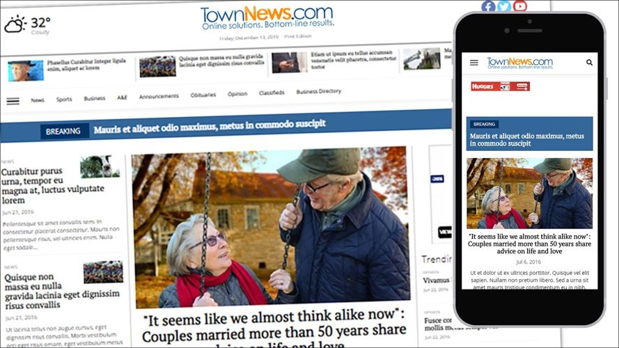
This week we are launching a new mobile-friendly grid called Centerpiece. In this new grid, there is a column in the center of the main layout area where top stories can be placed. This centerpiece region, when collapsed into a mobile size, will be at the top of the content in the mobile view.
This prioritization of the center column only happens on the front page. Index pages keep their same content order.
The grid also features breakout full-width regions between the groupings of content regions. These breakout grids are great for promotional content, such as video spotlights, photo galleries or special sections. When used for advertising, these breakout regions can support up to a billboard size ad when on the desktop viewport.
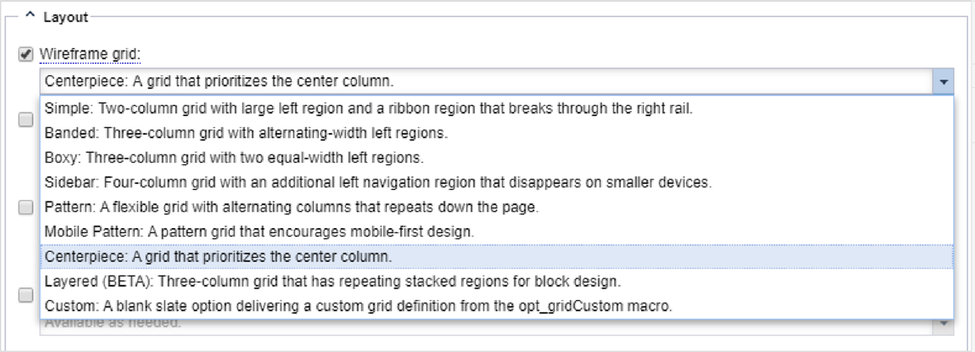
Each grouping of regions has a different pattern which can be used for creative block placement. Some patterns create an off-center layout, some create equal columns.
This new grid will be available in the URL properties for Wireframe grid in the Layout section.
Note: this grid features many new regions which don't exist on other grids. If you would like to test this on your site, we recommend using it on a test section first. Switching to a different grid which doesn't have support for a specific region will cause any blocks in that region to become disassociated to the URL. If this happens, you can find the blocks in the block library and add them again to the page.